QR codes are largely pointless.
The concept is decent. But the execution is flawed.
Think about it for a second:
You're forcing people to take an additional step to download an application prior to using it (because let's be honest, only sociopaths have QR code readers on their phone).
Design trends like flat design, unconventional navigation and carousel sliders are no different. They sound harmless in theory. Some are fun to mess with. But most can do more harm than good if you're not careful.
They're also perfect examples of how herd behavior can actually backfire and grind conversions to a halt.
Here's why, and how to avoid it.
When Flat Design Strikes Back
Parallax is like the design equivalent to Andre's fashion.
When used with discretion, it can enhance the overall aesthetic, breaking up important sections of pages with visually intriguing movement that adds layers and depth to the site.
But that's just it. When is it ever used sparingly?
Parallax is an innocent example though. We can gripe about the minor drawbacks here or there, however it's not gonna kill you.
Flat design has been another wide-sweeping trend the past few years, with the goal of bringing simplicity back to user interfaces. Again, it's largely beneficial. Until it isn't.
The premise of the excellent Don't Make Me Think is somewhat obvious. The best user interfaces (and online user experiences) make it easy for people to intuitively find things or figure them out.
Flat design becomes problematic for example, when you leave form fields naked. Or if you strip away critical shading, colors and borders. The result, is that you're making key page elements – you know, the stuff you want people to do on the page so you can get more $$$ – completely indistinguishable to the common user.
Those visual cues were there not just for aesthetic, but to tell the user what to do (and where to do it).
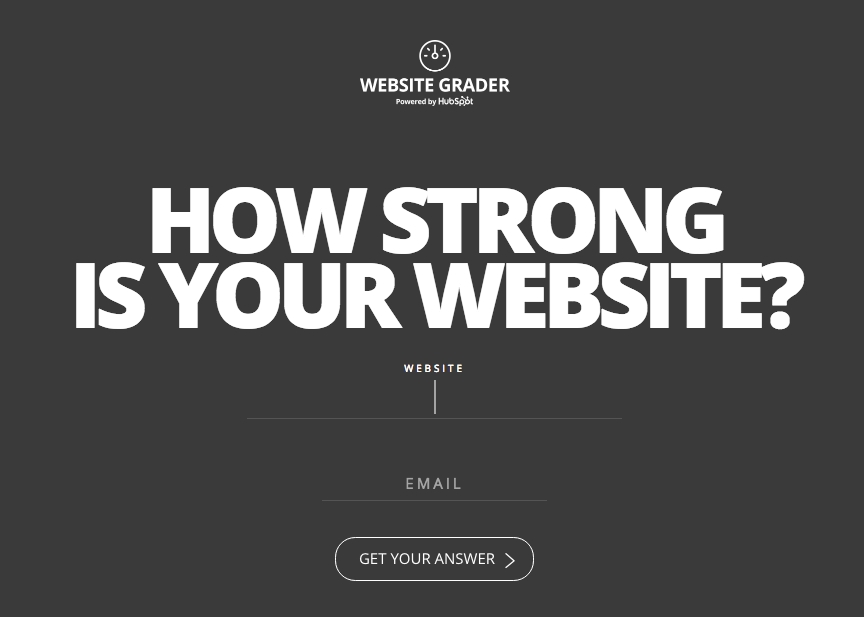
Again, flat design by itself isn't bad. What you do with it can be though. This HubSpot example below helps bridge the gap between using flat design to stay contemporary, yet providing interactive animations for the user like the form field lengthening (along with a blinking cursor) so visitors know exactly what to do when they get here.
Yet another example of cleverness sinking conversions are simple text links.
Links are one of the obvious primary page elements that (a) help people navigate or (b) are a precursor to conversions.
It should go without saying then, that text links should still capture some resemblance to the ones we've grown up on and become accustomed to seeing over the past decade+.
That means links should be some kind of blue. While an underline would also be nice.
This sounds so trite and obvious that we shouldn't need to debate or back up sources. But here's four for the hell of it.
Let's keep in mind though that many of these are relatively minor examples.
The more egregious conversion killers are still to come.
Putting the 'A' Back in IA
Information architecture (IA) is a fancy term that helps consultants charge more by making them sound smarter explains how stuff is organized on a website.
That means the logical organization of stuff into categories or buckets, how they're linked together, and how a user might flow from one thing to the next until they get to their intended destination.
The most obvious example of this problem comes when viewing your analytics data, and seeing people leaving your top pages in droves before they get to the money, err page.
Page navigation or menus should, in theory, help solve this. However that doesn't happen when they're multi-level navs or using overly vague naming convention as UserTesting.com has discovered after looking at 100,000 usability studies.
On large sites, they point to Amazon as a great example of using a large pop-out section to avoid the difficulties often associated with multi-level navs.
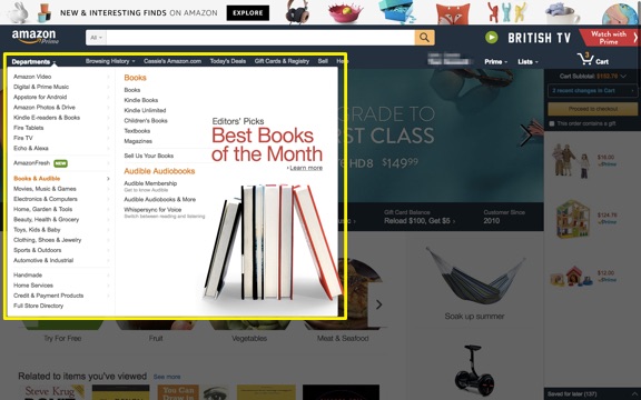
Largely because they can see all of their options at once, without needing the fine motor skills of a professional athlete to carefully select yet another drop down and avoid having to start over completely like a third grader that keeps failing the same level of their favorite Xbox game.
There should also be a clear site hierarchy that helps users intuitively understand what's primary, what's subordinate, and what's a subgroup.
Navigation labels can also trip people up, especially when uncommon terminology, overly clever or internal names are used in place of the obvious, yet standardardized options.
It's also a baby step away from talking past your customers and losing them entirely. From a broader perspective, it's also a perfect microcosm that illustrates when a company's worldview is completely opposite of their customers.
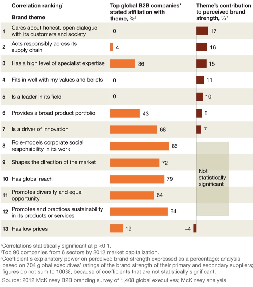
When in doubt, standardize. Even better, is if you include some 'trigger words' that get people to take action.
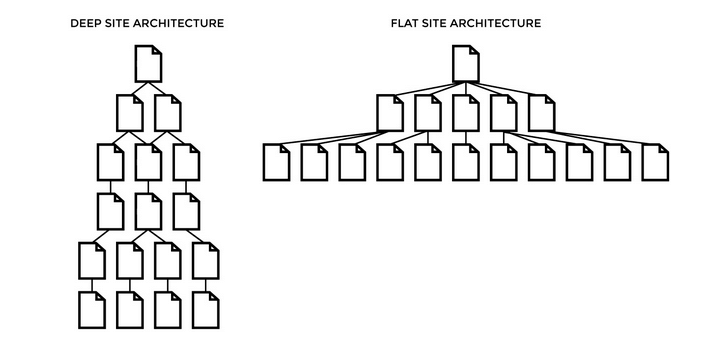
Beyond the design and labeling, keeping your site hierarchy flat can help keep the most important information just a few simple clicks away from most primary pages. Stuff doesn't get buried, or lost down a rabbit hole of endless subcategory scavenger hunts.
Beyond helping visitors find stuff, which in turn should grease conversions, these improvements also help SEO. The better the organization, the more people come to the site, the better the experiences and the more conversions. (I would call this synergy if I wasn't afraid of you calling me a D-bag.)
All of these issues bring us to one of the biggest pet peeves of all. And this one really gets the blood boiling.
It's finally time to bring up the elephant in the room: F-ing carousels.
Carousels: The Epitome of Groupthink in Action
B2B companies love themselves some carousel sliders.
In a quick analysis conducted for Search Engine Land, one author found 18 out of 30 B2B websites (in different industries no less) all had one directly on their homepage.
Despite the data-backed facts that they're terrible usability, conversions, and speed. Three things that fly in the face of good web experiences.
Why are they so bad? Let me count the ways.
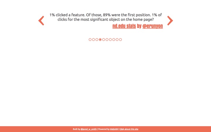
For starters, people don't actually use them (like less than ~1%). For example, peep the data from Harrison Jones' aforementioned Search Engine Land analysis:

In each of the three scenarios, the slide received a less than 1% click through rate. Part of the reason, is because these pervasive sliders can mimic banner blindness (thus causing people to ignore them entirely).
Beyond the fact that nobody actually clicks on them, they also commonly fail to load properly on mobile devices. While also potentially hurting SEO a number of ways by (1) not having static content (2) misusing header tags, (3) using high-res images that might slow the site down, and (4) resulting in 'thin' content if outdated technology is used.
Ok, ok. If they're so bad, why do companies keep using them?
Compromise.
Therefore it's not just the carousel itself that's so bad. (Although as we've established, they do suck.)
What's so bad about carousels is how they happen.
They're the result of too many cooks in the kitchen. Too many HiPPOs in a room that all want their voice heard, or interests promoted, front-and-center on your website's most valuable real estate.
When design by committee happens, everyone loses.
Designers lose because their excellent work slowly erodes away.
Marketers lose because their voices get overrun and ignored.
And ultimately the very same HiPPOs lose because their selfish actions – well intentioned or not – ultimately result in a worse web experience for visitors, which results in lower website conversions and less revenue.
Conclusion
Offline, print design is static and passive. Its focus is on beauty and art.
However web design is about interaction. Its focus should be form and function. Utilitarian even.
Design trends like flat design, parallax, navigation structure and labeling can all have a significant impact on the success (or failure) of your site.
Elements like carousel sliders not only water-down your objectives, but actively work against them too.
The bad news about web design is that it's never finished.
But the good news about web design is that it's never finished. You're unable to truly fail if you own up to mistakes by quickly making them right through embracing testing and iteration.
About the Author: Brad Smith is a founding partner at Codeless Interactive, a digital agency specializing in creating personalized customer experiences. Brad's blog also features more marketing thoughts, opinions and the occasional insight.
Walang komento:
Mag-post ng isang Komento