Lunes, Nobyembre 7, 2016

How to Use A/B Testing to Build Your Business's Buyer Personas

As a discerning digital marketer and business owner, you're on top of the latest trends and tips on how to convert.


You know all about SEO, and CRO, and PPC (that's a whole lot of acronyms). You're an active content creator, social media participant, and advocate for your brand.


And you, of course, recognize the power of the buyer persona.


Most successful businesses – from ecommerce to SaaS and all points in between – have at least one or two at the ready. They act as a guide, providing hints and suggestions on the best way to do something – anything – in order to appeal to your customers.


Without them, you're flying blind. But let's back up for a moment.


Buyer Personas?


Creating buyer personas is a useful exercise for any business: if you don't know exactly who you're going after, how can you possibly expect to find, connect, engage, and convert them?


Personas allow you to zero in on the ideal target in your marketing, your content, your communication, and virtually everything else.


Many companies complete persona cards with photos, descriptions, and identifying characteristics (just as an author might do for each character in the story…the personas represent each “character” in your story). They name the individuals, and refer to them by those names.
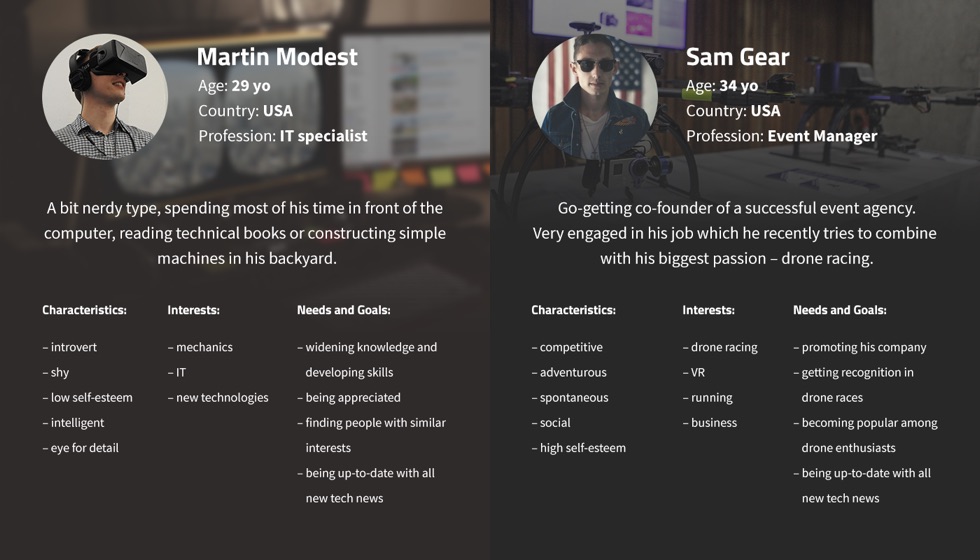

user-personas


They define the various types of buyers for your product or service, including their demographics, motivations, interests, beliefs, and emotional responses. Personas are detail-oriented and contain many parts beyond just the obvious (age, gender, location, and so forth).


Personas Just Make Sense


If that all sounds well and good – a cute albeit not terribly valuable activity – you're not seeing the bigger picture. In the uber-competitive modern business world, buyer personas are a pivotal component.


Think about it: a concrete buyer persona lets you get inside the head of your customers and prospects. You're no longer making guesses or assumptions about what they might like, want, need, or respond to. You know.


Mark Schaefer of Business Grow says that 3-4 buyer personas typically account for 90% of your sales. Why? Because everything you throw at them is already targeted and exactly what they've been looking for. It's an easier (if not easy) sell.


Buyer personas = good.


Your buyer personas are a fictionalized version of your (very real) ideal buyer(s) based on legitimate data and validated common traits.


The Data Deluge


But just where does this data come from? Take your pick:


  1. Search terms used to find you

  2. Content they view, search for, or download on your site

  3. Heat maps (what is drawing their attention)

  4. Search terms used on your site

  5. Speak to your sales department about customer details

  6. Customer surveys

  7. Customer feedback

  8. Contact database

  9. Market research and segmentation

  10. Social media (Facebook Insights and Twitter Analytics, for example)

  11. Competitor data (Similar Web and Compete can provide details)

  12. Analytics (language, location, device, behavior, interests, etc)


These represent the usual suspects. Unfortunately, some of them – most notably surveys and questions – can be misleading. People aren't always 100% honest with their answers, either intentionally or accidentally.


A more atypical method – and one that can provide some seriously targeted data on your buyers and visitors – is A/B testing. It uses natural customer behavior and response to clarify and strengthen your personas.


(For more information and advice on buyer personas, check out The Complete Guide to Building Your Personal Brand, 20 Questions to Ask When Creating Buyer Personas, or How to Create a Buyer Persona Map)


A/B Testing?


You've no doubt heard about A/B testing already. It compares audience behavior and reaction to two samples – a control and a variation – to create powerful landing pages, effective email messages, and website design that resonates with an audience.


It allows for data-supported decisions that incrementally improve the performance of something. A tweak here, a different headline there, all moving towards better conversions and (ultimately) more revenue.


If you're not certain what it's all about, a good beginner's guide can bring you quickly up to speed (it's not hard to grasp the basics). A master's guide can dig a little deeper and explain in greater detail.


Either way, make sure you're including it at some level in your marketing and communication efforts.


Testing is Easier Than You Think


A well-crafted testing plan is essential to modern marketers. What's not working can always be fixed. What's good can always be better.


It allows you to gradually find the optimal design/wording/structure for your particular target. It's not a quick fix. It's not a shortcut. It's just smart, savvy behavior for the digital 21st century.
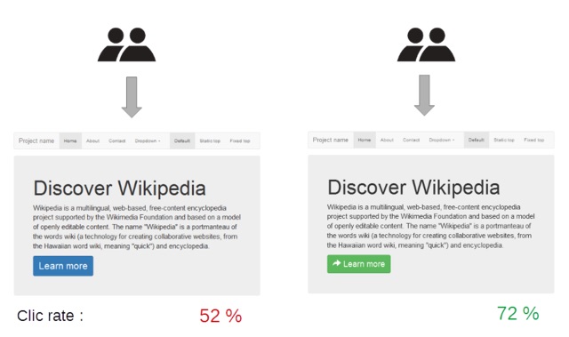

discover-wikipedia-click-rate
(Image Source)


A/B testing = good.


Testing can find big improvements from small changes. SumoMe, for example, A/B tested a video version versus the text control of their landing page for an email list building guide and discovered a 55% conversion lift (from 8.86% to 13.7%).


But A/B testing goes beyond just trying two different versions. It can do so much more than just determining whether your visitors prefer a red or blue CTA button. It's more akin to a science experiment, with the procedure to match. It involves proper prep and planning.


A strong test adheres to the following steps:


  1. Data collection (how's the control performing?)

  2. Goal (what are you trying to improve: conversions, sign-ups, sales, bounce rate, CTR, open rate, social sharing, dwell time?)

  3. Hypothesis (what might be influencing the performance?)

  4. Brainstorm variations to test (only test one at a time)

  5. Run the test

  6. Analyze the results


There are A/B test mistakes to avoid, and common pitfalls can actually hurt your conversions and your website as a whole. A checklist to remind you of the dos and don'ts is a handy resource.


Tools for Testing


The services available for testing run the gamut from free and barebones to (much) more expensive and feature-rich. As with everything, you get what you pay for. If you have the budget and know-how, a robust testing tool is definitely worth the investment.

content-experiment-add-urls
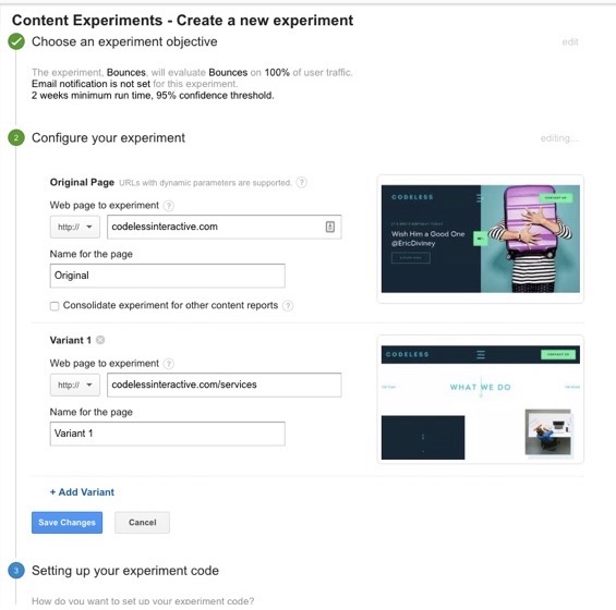
Google Content Experiments allow for simple split tests.


Some of the best and most popular A/B tools include:


Using A/B Testing for Your Buyer Personas


Are you starting to appreciate the connection between these two? A/B testing can be used to steadily improve your existing buyer personas. It can fill in the blanks or areas of questionable validity.


It provides verifiable hard data on what is resonating with your visitors and customers based on their actual behavior. And if you know that, you understand them on a deeper level than you'll likely experience by asking them.


The Proof is in the Pudding


Some of what you include in your buyer personas is subject to interpretation. You have hard data that suggests your buyers don't like X, or believe Y.


The advantage of A/B testing your buyer personas is that you can either confirm or refute that in no uncertain terms.


But how?


Testing Your Ideas


Let's pretend you own a security company that sells alarms and other personal security apparatuses.


Let's further pretend that all the existing evidence strongly suggests your buyers are motivated by fear. Fear of what could happen to them and their family without the proper security measures in place.


That sort of attitude – if true – should directly influence your choices. You would speak to (but hopefully not manipulate) that fear factor.


But if you're wrong about it, your marketing would meet a very cool reception, and that translates to poor conversions and revenue for you. You could be alienating your buyers with negative and fear-associated vocabulary, images, and statistics.


Enter A/B testing.


A simple test comparing one page that appeals to fear and another that appeals to, say, the proactive peace of mind that comes with your security package (with no mention of the bad stuff that might happen without it) would confirm which resonates more with your buyers. Which one had the greater sign-ups for a no obligation security evaluation at their home? That's your true buyer persona.


Whatever your assumptions and beliefs about them, a simple A/B test can bring it all into focus.


  • Is their chief buying motivation A or B?

  • Are they more concerned about X or Y?

  • Do they respond to negative or positive language?

  • Is the main selling point for them this or that?

  • Are they pulled into action by discounts, coupons, sales, or BOGO offers?

  • Do they prefer step-by-step how to guides, or summary checklists?

  • Is feature A or feature B the biggest draw?

  • Do they react most to benefit A or benefit B?

  • And on and on and on…


Get your feet wet with the free and basic Google Content Experiments feature in Google Analytics to test one against another. Just be sure to frame each one as a testable hypothesis (“I believe my buyers are motivated more by the money they can save than the ease of use”).


The Eisenberg Customer Modalities


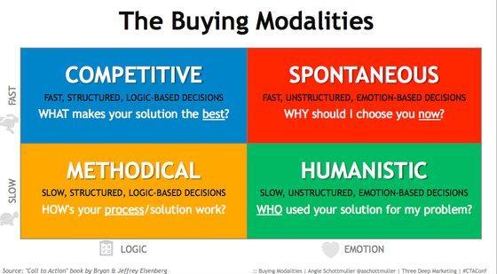
Introduced by Bryan and Jeffrey Eisenberg in their book Waiting for Your Cat to Bark?, the customer modalities classifies each buyer as one of four different types:


  1. Competitive

  2. Methodical

  3. Spontaneous

  4. Humanistic


Each is characterized by the speed of their decisions, and whether they're driven by emotion or logic. It's just one more example of how you could organize your customers and frame your marketing, content, and communication for them.

buying-modalities
(Image Source)


Are your buyers mainly methodical – motivated by logic, thoroughness, details, and the slow approach – or spontaneous – making snap decisions based on their gut and the excitement of the purchase? Both would demand a very different marketing approach.


Not sure? Test, test, and test your working hypothesis. They each want something different from your website and content.


  • Competitive buyers want to know what makes you the best, and what your product/service does for them.

  • Methodical buyers need to know exactly how your product solves their problem or addresses their need.

  • Spontaneous buyers are concerned with why your product is the right fit for them at this moment in time.

  • Humanistic buyers expect to see your product being used in the real world. They want to see case studies, pictures, testimonials, and examples. They demand a little bit of personality.


The humble A/B test can remove all lingering doubt. Slot your buyers into their personas with full confidence that you know what they want and what makes them tick.


And once you know that, you can craft everything for them specifically. Your personas are tweaked, refined, and polished one hypothesis at a time.


It won't happen overnight, but you'll eventually end up with personas that are accurate and battle-tested. You'll be able to climb inside their head for anything and everything. You'll slowly but steadily know what you need to know in order to connect, engage, and convert like a boss.


Buyer personas and A/B tests are good. A/B testing your buyer personas? That's better. That's marketing for the digital age.


Have you experimented with A/B testing your personas? What insights did it reveal? Leave your comments below.


About the Author: Aaron Agius is an experienced search, content and social marketer. He has worked with some of the world's largest and most recognized brands to build their online presence. See more from Aaron at Louder Online, their Blog, Facebook, Twitter, Google+ and LinkedIn.
Biyernes, Nobyembre 4, 2016

Commercial Real Estate Forecast in 2017 Is Strong

ORLANDO, Fla. (November 4, 2016) - Sustained by improving job growth and strong demand for multifamily housing, commercial real estate has been steadily recovering in recent years. Looking ahead to 2017, growth is expected to flow into the smaller markets, according to a commercial real estate forecast session today at the 2016 REALTORS® Conference & Expo.


Lawrence Yun, NAR chief economist, and K.C. Conway, senior vice president of credit risk management at SunTrust Bank, expressed... Read More

Why a lot of people are moving out of California

More U.S. residents are moving out of California than moving in.

How to Keep Customer Analytics at the Forefront This Holiday Season

The gift of analytics.


Ramp up for the holidays by focusing on customer analytics. With the help of data, your team can target buyers, plan seasonal promotions, and manage your inventory levels.


Research shows that “49% of companies who champion the use of customer analytics are likely to have profit well above their competitors.” It's one of the best ways to differentiate your business in the market.


“Customer analytics enables organizations and enterprises to make data-driven business decisions for direct marketing, site selection, and customer relationship management. The result is a 360-degree view of customers,” says Molly Galetto, vice president of marketing communications at NGDATA.


This holiday season aim to study your data. Let's explore how you can earn more sales.


Take an Omnichannel Approach


Holiday shoppers will discover your products from various channels, including mobile, email, and offline activities. Prepare to serve their needs no matter how they find you.


PricewaterhouseCoopers announced that two-thirds of shoppers can be considered omnichannel consumers. These people research products and make purchases using a combination of technology, online platforms, and physical stores.


For instance, shoppers may see your product via a Twitter ad, and then conduct brand research on their tablets. And finally purchase your product from their desktop computers using an email promo code.


Buxton reports that “the average consumer doesn't think about the complexity of merging offline and online retailing. They simply know that they are purchasing a product from your brand and expect their experience to be the same no matter what channel they use.”


Work with your team to develop a seamless experience across channels. Customers shouldn't feel confined to work with one or the other.


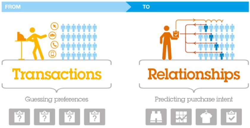
Observe consumer habits to determine how your audience interacts on each channel. This will help your team predict purchasing intent. Then, aim to build interconnected relationships, not one-off transactions.


from-transactions-to-relationships
(Image Source)


Ditch the mindset that your brand's online shop competes with in-store sales. Concentrate on integration for a better shopping experience.


“As shoppers are becoming more channel-agnostic, and more omnichannel in their customer journey, the retailers that are breaking through and meeting their demands are realizing the greatest returns this holiday shopping season. It's no longer about brick and mortar vs. e-commerce,” writes Stuart Lazarus, former vice president of sales at Signal.


Give holiday shoppers a choice. Let them decide the best channel for their purchasing needs.


Focus on Specific Shopping Days


All shopping days aren't created equal. Consumer purchasing habits change based on various factors, like the industry, product price, and the end user.


This season, stay away from mindlessly following your competitors-as they may lead you in the wrong direction. Plus, what works for their consumers isn't always the best for your buyers.


Use historical data to learn your sales peaks and valleys during the holiday season. Which days and times experienced an influx in sales?


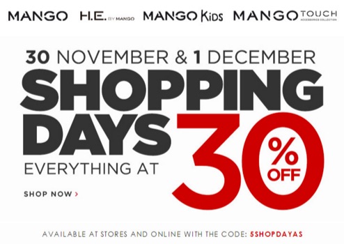
Then, focus your sales and marketing efforts on these specific days to gain consumer attention. Your brand may want to host promotional giveaways or offer a discount. And the time-constraint will urge shoppers to act now or risk missing out on the promotion.


shopping-days-30-off-ad
(Image Source)


RetailNext predicts that Black Friday will lose its title as the most popular shopping day this holiday season. The excitement of early bird sales is transforming into shopper's fatigue. Therefore, brands are shifting to a long-term strategy.


“With this in mind, retailers are now transitioning the traditional holiday shopping process into a month-long ordeal. Furthermore, retailers are noting the need for convenience and offering more omnichannel services to consumers,” says Genevieve Scarano, staff writer and assistant editor at Sourcing Journal.


During the holidays, make increasing customer value a priority. Persuade shoppers to learn more about your brand's mission and values. You want shoppers to stick around after the holiday rush.


Manage Your Inventory


During this time of year, it's important that your team monitor inventory. Bad inventory management leads to delayed order fulfillment, which extends your cash flow cycle.


In 2015, out-of-stocks accounted for $634.1 billion in lost retail sales. When your brand fails to deliver, customers get frustrated and seek out your competitors' products.


Overstocking isn't ideal either. You don't want a surplus of products taking up shelf space. Excess inventory costs money and negatively affects your bottom line.


“Missing out on sales because of stockouts is a scary thing – but this doesn't mean that you should overstock. Remember, keeping stock in your warehouse carries a cost of its own, both in terms of the cost of additional warehousing space, and the amount of capital that gets tied up in the inventory,” says Ruoshan Tao, an inbound marketer at TradeGecko.


Strive to create an optimal system that works for your business. Setting par levels is one technique that speeds up future decision-making.


Casandra Campbell, a content creator at Shopify, offers some sound advice:


“Make inventory management easier by setting 'par levels' for each of your products. Par levels are the minimum amount of product that must be on hand at all times. When your inventory stock dips below the predetermined levels, you know it's time to order more.”


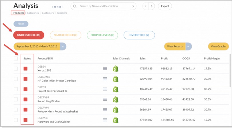
If you haven't already, invest in an inventory management dashboard. Then, you can be automatically notified when certain products fall below your par levels.


Here's an example showing a filtered list of all the understocked products. It's a simple process- even for your newest team members.


unstocked-product-list-ecommerce
(Image Source)


Forecast demand to make products readily available to customers and to reduce your costs.


Upgrading Customer Service


The holidays are hectic. Shoppers juggle everything from buying gifts to preparing holiday feasts. So, be mindful of your customer service efforts.


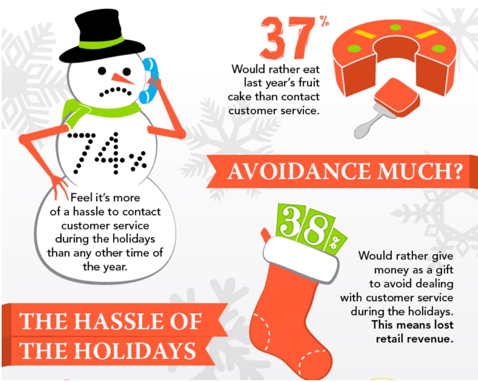
Studies reveal that some customers would rather avoid shopping altogether in order to skip the hassle of poor service. A lack of quality service wastes the buyers' time and causes them to stress more.


A stressed consumer will just abandon his shopping cart. And this equates to less revenue for your brand.


the-hassle-of-the-holidays-graphic
(Image Source)


Moreover, NewVoice reveals that 42% of consumers switch brands because they are put off by rude or unhelpful staff. This issue can easily be resolved by training your staff to show empathy to customers.


To upgrade your customer service, perform a quality control check of customer phone calls and emails. How do your employees respond to customer complaints? Or any of the customer's questions left unanswered?


This qualitative data will offer insight on how to improve your service. The results may involve hosting a formal training for all staff members or coaching specific individuals.


Use the gathered data to learn the problems plaguing your customers. Identifying issues early helps your team solve the problems sooner, rather than later.


“For this holiday season and beyond, it's crucial to empower customer service with the analytics capabilities needed to pinpoint and truly understand customer issues in order to deliver a seamless customer experience and ultimately ensure brand loyalty,” says Ken Bisconti, vice president of IBM Customer Analytics.


Experiment with different customer service methods. Make your shoppers' lives easier.


'Tis the Season for Analytics


Don't neglect your use of data this holiday season. It's an opportunity to connect with more shoppers and drive your revenue upward.


Prepare to sell consumers through multiple channels. Focus on specific shopping days to maximize your promotions. And continue to upgrade your customer service to relieve buyers from the stress of shopping.


Pay attention to your customer analytics. Happy holidays!


About the Author: Shayla Price lives at the intersection of digital marketing, technology and social responsibility. Connect with her on Twitter @shaylaprice.


Huwebes, Nobyembre 3, 2016

Ensuring a Great User Experience Is the First Step in CRO

Many business owners think of conversion rate optimization only after they realize their websites don't convert well enough. That means hundreds of potential customers have already been lost; and, until various CRO methods are tried out, additional hundreds will leave their site without taking any action.


There's another way. Taking care of user experience (UX) from the very beginning (even before a website is designed) is a way to avoid those losses.


Here's how.


UX Research: Getting to Know Who You Want to Convert


Interviews and Surveys


If a website is supposed to convert, the knowledge about its visitors can't be limited to a list of demographical features and a set of assumptions about lifestyle and interests. To adjust the site to visitor needs and expectations, you simply need to know what those needs and expectations are.


The best way to get that knowledge is to conduct interviews or surveys. It may seem like a lot of work, but it's actually less time-consuming than you might think. Instead of inviting dozens of target visitors to a conference room, you can conduct a few Skype interviews. Then, with the help of some free online tools like Google Forms, it won't take long to create a survey, which can be easily distributed by email.


The first thing you need to do is find the right respondents. Social media is a great help here.


Let's imagine you're selling car parts. In such a case, you'd find many of your potential customers in Facebook automotive groups and among participants of various motor shows.

On LinkedIn, you could search for car mechanics and followers of your competition – other automotive ecommerce stores.


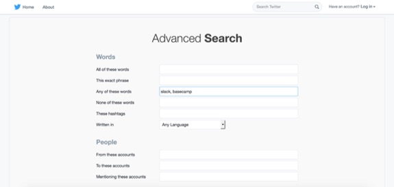
It's similar with Twitter. Using advanced search, you can easily find people who use specific hashtags or follow particular accounts. Then all you need to do is contact them and ask them to take part in your interview or survey. If it's online and you offer a discount or coupon in return, you should gather enough candidates (and probably gain a few new customers as well).


Additionally, if you already have a working website with visitors from your target group, you can use Hotjar polls, Intercom, or Qualaroo to invite those visitors to your questionnaire or even conduct your interview or survey for you.


twitter-advanced-search
Using Twitter advanced search is a good way to find interviewees. You can target the search, for instance, by typing in the names of your competitors.


There's no one simple recipe for preparing the right interview questions, but the most important thing is to focus on the target visitors – their needs, motivations, problems, and expectations – not on the future website.


Don't ask interviewees whether they want a particular feature or if some element should be placed on the left or on the right. Instead, follow advice from Charles Liu: build your questions in such a way that you will get insights into what visitors would like to achieve through your website, why they want it, and what problems they could encounter along the way.


The rules for survey questions are basically the same, but since you won't be talking to the respondents directly, you should also apply the following tips:


  • Inform respondents why the survey is being conducted and how long it will take. (The respondents will be more willing to take part in a survey knowing it will take only a few minutes of their time. In general, your survey shouldn't exceed 15 minutes.)

  • Start with questions that determine if you're indeed surveying the target visitor. (Otherwise, you might end up with completely irrelevant results.)

  • Make sure the participant understands the task. (Use simple language and popular question formats, and provide instructions.)

  • Balance the number of open-ended and close-ended questions. (If the participants see too much of the former, they might feel overwhelmed and not finish the survey.)

  • Don't give options like “I don't know” or “other.” (These won't provide you with any data.)


For more information, you can check out this set of articles on best practices for every step of survey creation.


Personas


The analysis of survey or interview results shouldn't be summarized only in terms of numerical data. If you want your website to convert, it has to serve real people. That's why you can't treat website users as inputs on a spreadsheet. A good way to summarize the questionnaire results in a user-oriented way is to create personas – generic profiles of target website users.


user-personas
Personas make the concept of target user less abstract so it's easier to address the actual user needs.


Each persona (usually 2-3 are enough) is based on the most frequent characteristics of the interviewees. When all the characteristics are put together, they should form profiles of life-like human beings. Give them names, think of their life stories, and list the most important personality traits, interests, and needs. This way, the concept of target user becomes less abstract, and, as a result, it's easier for you to address the visitor needs.


With online tools like Xtensio Persona Creator and HubSpot MakeMyPersona, preparing personas is quick and effective. And, though it seems like playing The Sims, it's worth spending extra time on. That's because, in the same way it's easier to buy a great gift for someone you know than for a stranger, it's easier to make a converting website for a user you are familiar with.


UX Canvases


The answer to “How do I increase my conversion rate?” is actually quite simple: address the visitor needs. You already know them so it should be quite simple. It is not.

The key to conversion is relating all the information about the target user to your business and its future website. To make that process fruitful, yet organized, it's worth it to use one of the UX canvases – user-centered variations of a very popular Business Model Canvas.


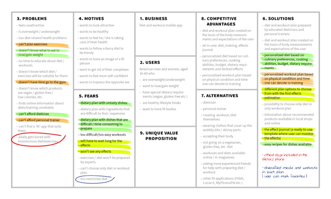
User Centered Design Canvas is a simple 9-fields tool. The left side focuses on the most important information about the users – their problems, motives, and fears. The right side concerns the business (or, as in this case, the website) in relation to its target customers. Experience Canvas is an alternative which has 9 main fields, and also includes places for the initial hypothesis and the final decision.


user-centered-design-canvas
Highlighting is a great method for making sure the solutions you come up with address user concerns.


Working with the canvases helps to systematize the ideation process. And, since the most important information is kept in one place – a piece of paper – it's easy to refer to it at any time later. What's more significant, no matter which canvas you choose, going through the fields one by one allows you to come up with solutions that are truly adjusted to the target website visitor.


UX Design: Creating a Prototype of a High Converting Website


User Journeys


Knowing what the visitor needs and which website features have the potential to fulfill those needs often isn't enough to ensure high conversion. You need to focus on when the user needs a particular feature as well.


For example, most visitors will need pricing information, but the question is whether placing it in the very first website section will encourage (or discourage) them to further explore the site. Your goal is to organize the information in the order your specific visitor will need it. To do that, it's crucial to think over the user journey.


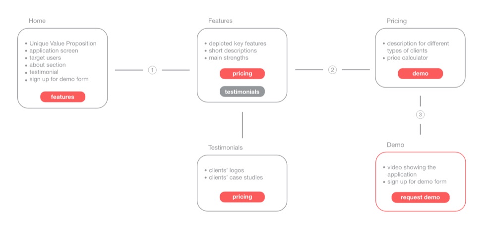
There are multiple approaches to creating user journeys, but in its basic form (nicely explained in the UX review beginner's guide), a user journey is an ordered series of potential actions the visitor may take on the website. You can think of it as a variation of the conversion funnel.


user-journey-through-website
Often, it's useful to include all website sections and calls to action in the user journey.


With all the information you've already gathered, preparing a user journey shouldn't be very difficult. Knowing the main goals of the user, imagine the context of their visit to your site and answer what they will look for first and what their next steps will be. You can order your answers by writing the main website sections on post-its and sticking them to a wall. Your user journey can be a simple diagram, but you can also get inspired by more complex user journey examples on Pinterest.


Wireframes


Before taking care of the design of particular pages, you need to think over all their elements. You'll find numerous articles on where to put calls to action and what should be included in the About Us section. Often they're worth reading, but keep in mind that websites users aren't one uniform group. If high conversion is the priority, you need to focus on your visitors.


User journey should be the guide here: the easier it is for the user to complete his or her path, the better. There's no point in including useless elements. They'll only distract visitors and move them further from the paramount goal – conversion.


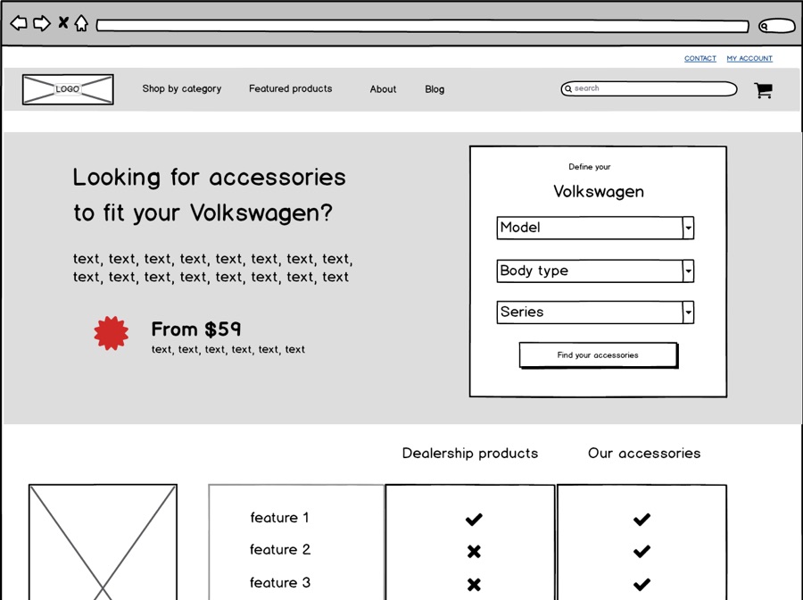
Placement of website elements can be easily visualized on wireframes – representations of the page skeleton. Wireframes aren't precise in terms of color, copy, or font; they focus mainly on the size of chosen page elements and their spatial relationship to one another. You can make them using software like Balsamiq, or you can download one of the free Photoshop or Sketch kits, but it will also be perfectly fine if you simply draw them on a whiteboard, a piece of paper, or some printable wireframe template like Sneakpeekkit.


balsamiq-wireframe
Wireframes help to visualize the future look of the page and assess its usability at an early stage.


After they're ready, it's worthwhile to test different wireframe versions with a few of your target users. No one will tell you better than they will which of your ideas are more intuitive and useable. UserTesting Blog provides a nice set of questions to ask during the wireframe test. If the results are positive, your prototype of a high converting website is ready. Then, of course, it's time to write the copy and design the site, but that's a topic for a different article.


Conclusion


Going through these exercises is a way to adjust your website to user needs at an early stage and therefore ensure the highest conversion rate possible from the start. Conversion rate optimization based on “magic tips and tricks” that treat all website users as one group with the same needs and expectations is, in many cases, no more than a guessing game. Adjusting your site to specific visitors and ensuring their positive experience is a more efficient way to achieve a high conversion rate.


About the Author: Anna Kulawik is a content writer, UX enthusiast, and cat lover who enjoys exploring psychological theories and their influence on user experience. She works at The Rectangles, a multidisciplinary design crew with a strong user-oriented approach.


Miyerkules, Nobyembre 2, 2016

7 Lessons from Top Performing Drip Email Campaigns

Automated email workflows can net you 20% more sales opportunities.


They're more personalized, timely, and targeted.


The problem, is that the vast majority of marketers – as high as 85% – are unhappy with their performance.


Not the results of those campaigns. But of their own execution or implementation of them.


Instead of rehashing the same onboarding campaigns from the same companies that others have covered well, I spent a Sunday morning digging through my inbox to find examples from different industries. (Sounds like a fun weekend, right?!)


The objective, was to pick out different campaigns at random that were each utilizing different personalization techniques to give you a fresh approach and hopefully inspire new ideas.


Here are seven (plus one special bonus) to emulate, research, and try for yourself.


1. Time Etc. Specific Task Spotlight


Tell me if this sounds familiar.


You find (or hear) about a new amazing service.


First pass, it looks awesome. So you sign up, mess around for a few minutes, and… ?


You hit a wall. A blank. And you're not sure what to do next.


There's a reason the vast majority of free trials (~50%) don't turn into free accounts. People aren't sure what to do next, and they haven't seen that 'first win' yet.


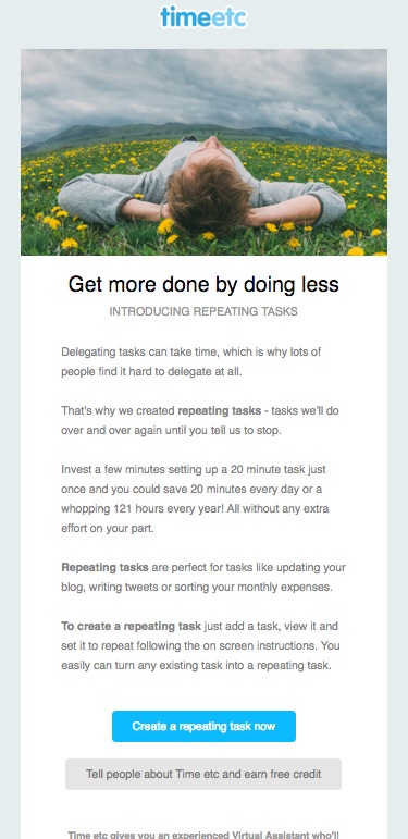
UK-based, virtual assistant service, Time Etc., sends an early task or feature highlight to new sign-ups who haven't used the service yet. The goal is to avoid this decision fatigue by helping to prompt people with specific ideas for what to do next.


For example, this one focuses on creating a new repeating task.


time-etc-repeating-task-email


The single column email is just long enough to provide context to a user, before expertly using a primary (create the task now) and secondary CTA (learn more) to get started.


The hope, is that these leading emails can jog some ideas in those reading it, getting them thinking about ways around the initial problem that blocked them from taking the first critical step in the first place.


2. Rock & Roll's Event Repurchases


The Rock & Roll Marathon Series has grown from humble beginnings in my beloved San Diego, to now stretching out across most major U.S. (and some European) big cities.


They now regularly feature 30,000+ attendees running urban courses with bands, DJs, and more every mile or two of the half and full marathon routes.


As anyone's who's thrown an event can tell you, they rely heavily on early sign-ups (even at discounted prices) and repurchases (from past happy attendees) to help forecast and make up for the fact that most will wait until the very last second (and they've already shelled out the money to organize everything upfront).


That brings up two key segmentation features:


  1. By Location

  2. By Event


Let's start with the basics:


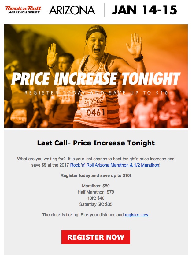
rock-n-roll-marathon-arizona-email


The first example highlights a simple event segmentation, sending a scarcity-based promotional message that would make even Cialdini happy.


This one's relatively straightforward, relying on the urgency of an early pricing discount expiring to be the entire messaging.


The second is slightly more nuanced.


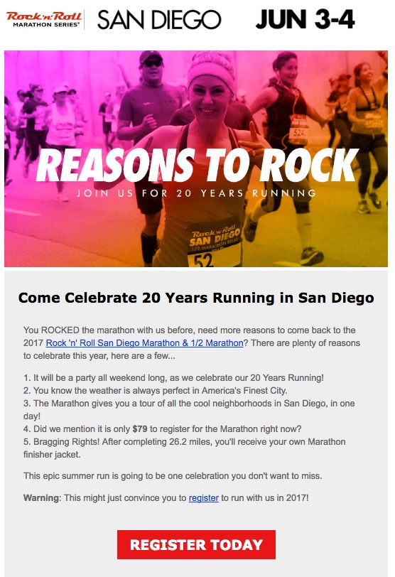
rock-n-roll-marathon-san-diego-email


This one is pulling in the (1) event and (2) location details to inspire (and hook) those who just completed that specific event in that specific city to repurchase.


Receiving these, in a succession of months, with the aforementioned urgency-based price increases, are like a war of attrition that slowly but surely whittles away a large list to capture as many early purchases as possible.


This example, along with the Time Etc. one before it, was relatively basic time sensitive examples (where campaigns are sent X days out from Y trigger).


Time to get a little more sophisticated.


3. Expedia's Recent Booking Abandonment


A hotel booking process is no different than an eCommerce checkout one when you think about it.


A sample of people begin the process, selecting dates (like products) to see how much the grand total might be, before getting distracted (or jumping over to a different product or website to compare prices) and leave the site.


The statistics are also (unfortunately) similar. While as many as 67% of eCommerce people might abandon a cart, 81% of people booking a hotel or travel might bounce as well.


The good news is if this user's logged in, you can track and react.


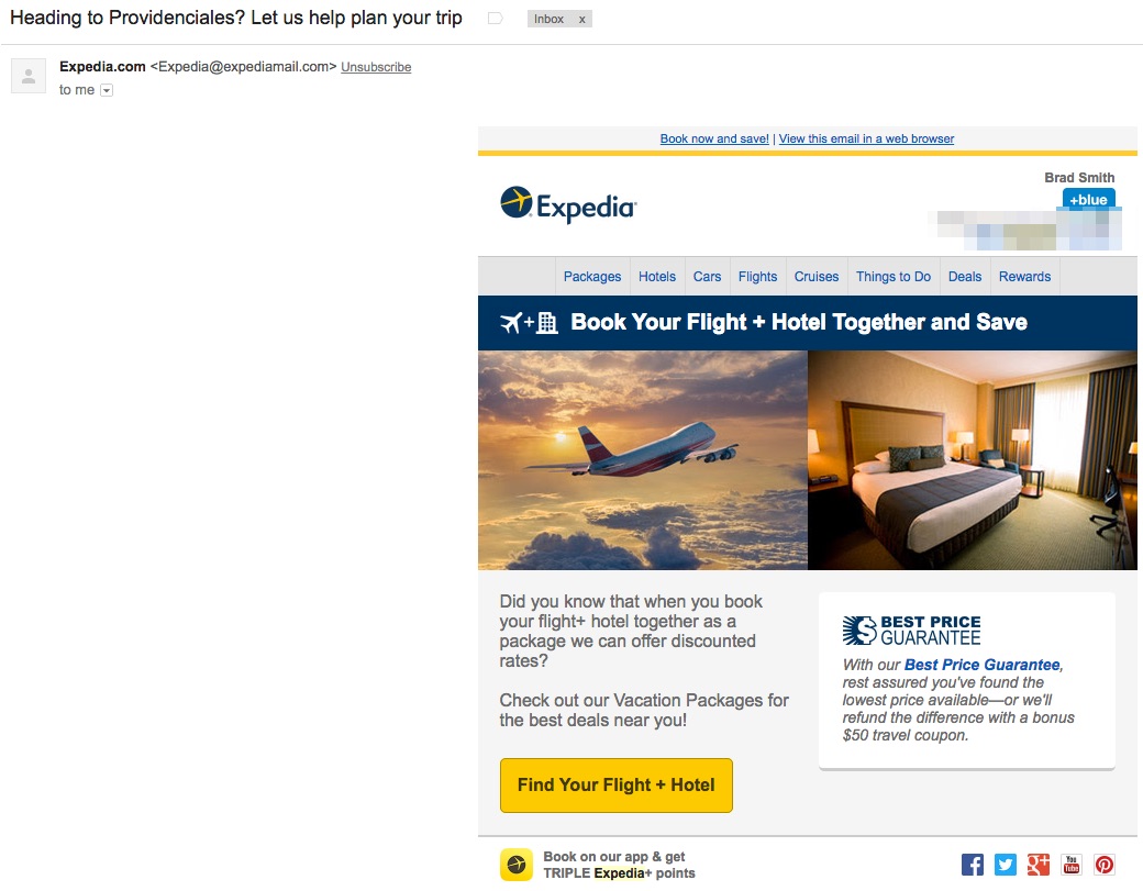
Case in point: Expedia sends these behavioral, event-based messages shortly after searching for hotels in specific locations.


The first example pulls in the specific city name in the subject line of the email, while the body copy tends to be a little more generic, focusing on the 'upsell' of booking an entire package vs. just selecting a hotel.


expedia-recent-booking-email


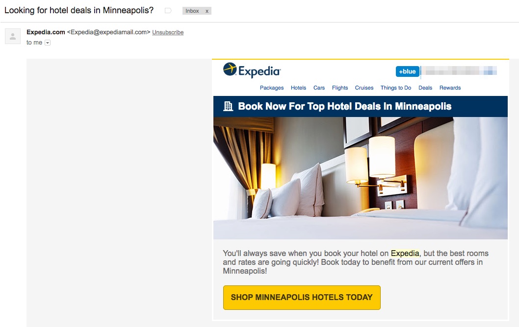
The second, features a subject line that's almost an exact carbon copy of the first (complete with personalized city-name).


However this time, the second one also features a customized message that personalizes the (1) headline, the (2) body copy, and the (3) CTA.


expedia-hotel-deal-email


This campaign successfully executes on message match; aligning what a user was just thinking about and doing on your site with the subject line (that will get their attention), and the email content (to get them to click).


4. Ramit's Warm-Up to Pre-Sell


There's one sure-fire way to learn from other marketers:


Ignore what they say, and watch what they do.


Some of the best digital marketers pull off a sleight-of-a-hand like a Vegas magician; distracting you with one thing over here while they're really laying the groundwork for a powerful move later in the act.


There's no better example of this than Ramit Sethi.


Subscribe to his email list (with a different email or at least some kind of filter) and watch the magic literally unfold.


You'll get tons (and tons and tons and tons) of text-based emails that do everything from grab attention, to engagement and trust building, before finally witnessing these brilliantly executed sales emails.


First, you'll be pre-segmented based on what offer (or where on the site) you opted in. Then you'll receive a mix of content that will switch from the regular ongoing stuff to more choreographed sales efforts.


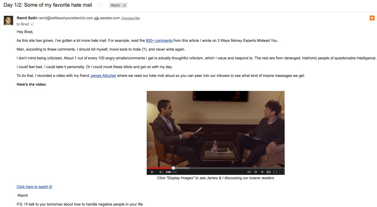
Typically you can see these coming with an anticipation-inducing “Day 1/X” in the subject line. The copy itself will start layering in social proof (like the number of comments, the number of emails, etc.) before closing with a specific call-to-action to get the reader from passive-to-active.


Here's one good example:


ramit-sethi-hate-mail-email


These start out slow. But watch how they build over the course of a few days (to a few weeks for the larger ones), increasing frequency by as much as 2-3 emails per day and altering the messaging based on if you don't respond, open, or click.


Watching how Ramit seamlessly transitions from focusing on problems and pain points to eventually providing a solution for those should help you not only rethink your email strategy, but all of your content marketing efforts too.


5. Audible's Proactive Churn-Reducing Outreach


Subscription-based services can be profitable. But it usually takes a few months.


They're capital intensive businesses, that require you to front-load cash into soft costs (like salaries, etc.) and hard ones (like advertising, etc.) to acquire customers that pay a little at a time (hopefully turning cash-flow positive within a few months).


A churn rate of 5-7% might be acceptable, but anything greater can quickly send your profitability into a tailspin at an accelerated rate (working almost like negative leverage – see: Bear Stearns).


Audible does a good job sensing or predicting churn and proactively responding to hopefully avoid it.


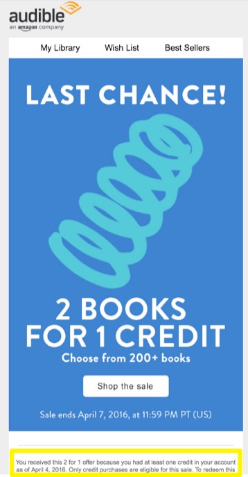
This promotion gives away something with a high perceived value (even though giving away an extra digital copy of something costs, well, air) to 'win-back' a customer's attention.


audible-last-chance-email


Highlighted in fine print at the bottom, you can see how they're pulling out a segment of people to receive this special offer (unused credits as of a certain date).


It's simple, but effective.


6. Mint's Important Win-Back Notification


Mint's another subscription-based service, however they don't charge consumers anything up front (instead relying on partnerships, revenue shares and affiliate deals).


That means they really need a sticky model that keeps people for months on end.


Deciding to take out a loan, or switch credit card companies, isn't a decision most consumers make lightly.


They also have this uphill battle at getting people to understand or recognize the problems Mint wants to help you solve (so they can get paid) – when that consumer's need awareness often doesn't exist in the first place.


So… how?


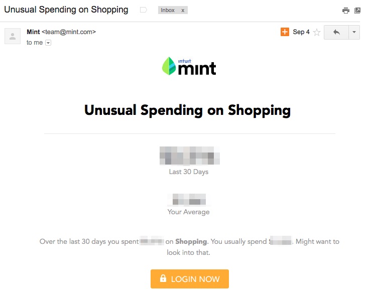
mint-unusual-spending-email


Mint tracks your personalized, historical averages and then sets up notifications or alerts when new aberrations pop up.


Some categories, like spend more on Travel, might be ignored because people are generally delighted to spend there.


However highlighting other frivolous ones, like Shopping, bring up all sorts of insecurities and question marks in someone's head.


The subject line and matching headline act like a cliffhanger; introducing the problem with a suspicious 'power word' (“Unusual”) before directing people to the road to salvation (that big, bright orange “Login Now” button).


7. Salesforce's Trial Expiration Sequence


We've already looked at the dismal statistics of free trialers to paying customers. So let's jump straight into the examples.


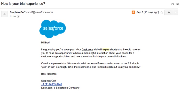
This sequence of three emails is being sent to based on the classic example: user (me in this case) logins in on the first day, before eventually failing to login back in or use the product over the next week of the free trial.


So midstream, Salesforce picks up on this and hints at it with the opening line of the email (“I'm guessing you're swamped”).


salesforce-trial-experience-email


The messaging around it goes for the soft-sell, trying to elicit some response or engagement of any kind so they can intervene and get you back into the product.


The personalized approach, design, and tone also help make it easy (and low-stress) for someone to reach out and get help (as opposed to 'be sold').


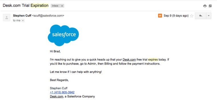
After not responding for a few days, the tone switches to a more direct, hard sell.


salesforce-trial-expiration-email


Again, the same personalized style is used to get that one-to-one interaction. But this time the language is less friendly and more business (relying on scarcity yet again to drive action).


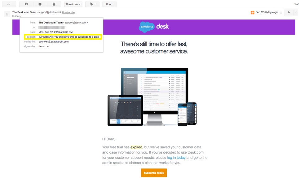
A few days later (after again not responding), a more generic re-engagement campaign goes with a 'action required'-style subject line, and a message that lets you know there's still time to recover your account and information.


salesforce-reengagement-email


Bonus: Inbound's Personalized Scale Outreach


Each of the examples listed above incorporate clever segmenting and behavior-based techniques to scale personalized emails.


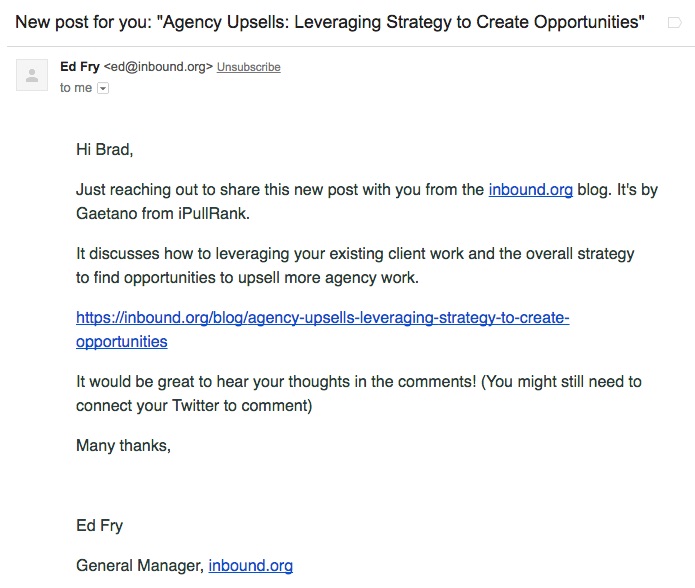
However one of my favorite (and most thought-provoking) examples comes from Inbound.org and Ed Fry that takes this to new extremes.


inbound-org-new-post-email


Inbound.org is a community-based site, which is completely dependent on members (of said community) logging in frequently and supplying it with content (posts, answers, interactions, etc.).


The above email incorporates extreme personalization at scale, using:


  1. My name

  2. My job title / profession (agency)

  3. My level of profile completeness (whether my Twitter is connected)

  4. My engagement (inserting these in between and other emails I receive from them)


Fortunately, Ed was kind enough to share his experience (and results) in running these personalized campaigns.


Ed likened these emails to multivariate tests (as opposed to a more general email campaign), because so many variables are at play within a single email (including the question being asked, the targeting, the messaging, and the lists being selected).


Unsurprisingly, incorporating as much specificity as possible reportedly resulted in the best engagement. So they would test subject line & messaging like:


  • Can you help Casey?

  • Can you help Casey's client?

  • Can you help Casey's PPC client?


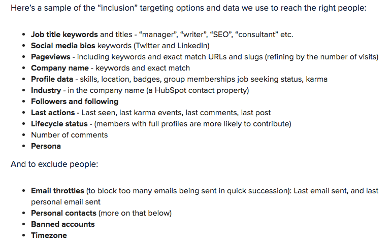
In order to create campaigns like this, you need a vast amount of customer data (along with the ability to create specialized lists quickly). Here's a sample of what they used to run these:


customer-data-in-email-campaigns
(Image Source)


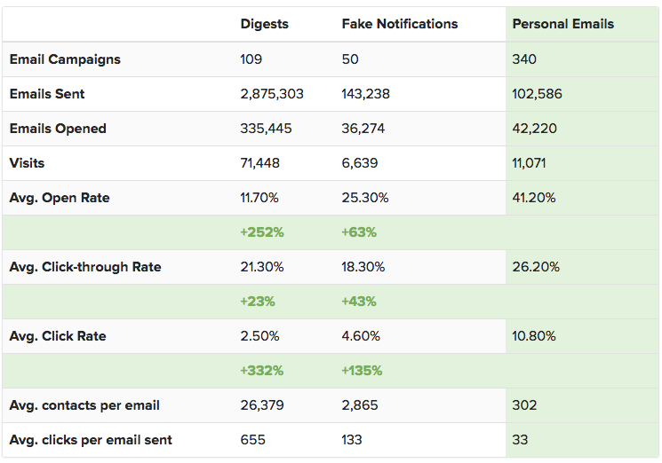
This extremely personalized approach is time consuming and complicated to pull off. But the results show extreme promise, too.


personalized-email-campaign-results
(Image Source)


Conclusion


Average website conversion rates are a depressingly low 3% in most industries.


Automated email workflows can help dramatically… assuming you're going above-and-beyond the basic, Hey $FNAME.


Instead, some of the best combine nurturing, timing, urgency, scarcity, and extreme personalization to break through the noise, get opened, and get clicked.


Use these seven (+1) examples as a starting point to analyze where your own are falling short, and a model for new techniques to experiment with going forward.


The glass half-full version, is that we have a lot of room for potential.


If the final Inbound.org example is anything to go off of, it's that most of us are still scratching the surface of truly personalized, data-driven techniques that work.


About the Author: Brad Smith is a founding partner at Codeless Interactive, a digital agency specializing in creating personalized customer experiences. Brad's blog also features more marketing thoughts, opinions and the occasional insight.